 Episode: Life's A Beach
Team Challenge: 3 3-person teams
Challenge: Design a beach cabana for an exotic local - Miami, St. Tropez or Tahiti
Budget: $3,500 for furniture and accessories at Pier 1; $2,000 for fabric from Pindler & Pindler and materials.
Assignment of tasks: each team assigns a member to: Fabric, Hardware and Furniture/Accessories
Additional help: an assigned carpenter; seamstresses appear in bonus videos
Design/sketch time: 30 minutes
Build: one day to build and prepare cabana structure for transport to beach destination
Set up: a few hours to set up. Total of 16 hours to complete the task.
Judging criteria: Overall design and execution, originality, ingenuity, how well they incorporated their destinations into the design and teamwork.
Guest Judge: Kathryn Ireland
Beach cabana's are generally private, exclusive, spaces where one can retreat from the sun and the prying eyes of other beach goers. This is their function and should be the most important aspect of the design (says the pale redhead who lives in a seaside community). Aesthetically, the cabana should be a luxurious oasis that complements the surroundings.
Let's look at the results:
Note: all the teams get kudos for completing their projects in such a short period of time under difficult circumstances.
Team Miami: Erik (Furniture/Accessories), Matt (Fabrics) & Elizabeth(Hardware)
 The indoor/outdoor concept was interesting, but didn't serve the functional requirement of escape from sun and other people. The color palette was really bilious and it's a shame that the designers didn't listen to Todd, who made it clear that they weren't capturing the essence of Miami. While it's great that they didn't want to go with the expected - traditional sherbet color palette that one associates with Miami - the fact is that those are the colors that are very prevalent on buildings, signs and on the beach.
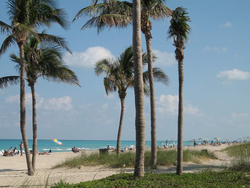

One of the issues to be taken into account is that bright sunlight washes out all but the most vibrant of colors and the blue skies, blue/green waters, and green grass will compete, and overwhelm, the man-made colors. The acid lime green and deep eggplants are really very muddy colors and while colors are subjective (I like green, I don't like purple) how we perceive them is affected by the lighting and other colors in the space. These colors just clashed and were poorly chosen.
I loved their floor and the two levels and thought the video of the inside space was comfortable and well appointed. I loved the angled wall planks - brilliant. I didn't like the beams across the top front - they seemed choppy and tooth-like. I liked the billowy curtain panels - but my very first thought was - car wash. I'm sorry, but it's true! My second thought was that it felt very breezy and cool. My third thought was that when inside the room - would I be hit with the flapping panels in a strong breeze? They created interest by adding some color to the bottoms of the fabric panels and created a lovely, vertical feel. The front shot is very welcoming and if I were walking by, I would have wanted to peak inside. Another aspect of the cabana is exclusivity. This was the only one that had an aura of mystery.
Team St. Tropez: Ryan(Furniture/Accessories), Carisa (Fabrics), & Goil (Hardware)
 This was an unfortunate mish-mash of ideas that didn't gel into a good design plan. It was a great feat of architectural skill (Goil!), but didn't fit the functional requirement of privacy and sun-protection. It would have been fabulous if the roof could have see-sawed up and down in order to cover up the front when the sun was full on. Or, that the panels could have rolled up and down to achieve the same result. In general, they were a bit too short and the verticality dwarfed the furnishings inside. The color palette was poorly chosen and the fabrics too heavy and bland for the ultra-luxe St. Tropez. Taking cues from the colors of a country's flag is a risky choice - especially if it's the same colors as are in one's own flag. It felt a little patriotic and clearly wasn't meant to.


The St. Tropez colors (from photos, I haven't been there - yet!) are natural earthy sunbaked tones - red clays, stuccos, terracottas, and of course vivid blue skies and waters. This teams structure - while very interesting architecturally - was a bit barren. Not much there there. This was a specific design choice and very much in Goil's aesthetic as we've seen so far. The side view was more appealing than the front side, I thought. I think that Ryan is not in his element when it comes to selecting interior finishes, colors and accessories. His work to date has shown a lack of taste and sophistication; he doesn't seem to understand elegance - he's more concerned with "pushing the envelope". Carisa - who to date has shown a surprising strength in creating a whole space vision and vibrant color palette - seemed to suffer from a lack of imagination, perhaps stemming from the fact that she felt relegated to the fabric purchasing task. The inside was an unfortunate mess. The heaviness of the fabrics, furnishings and accessories weighed down the structure, yet were also diminished by it, scale-wise. This didn't result in balance - but in dis-harmony.
Team Tahiti: Felicia(Furniture/Accessories), Michael (Fabrics) & Andrea (Hardware)
 This team sought to capture "shape and form of the typical Tahitian hut" and they clearly nailed it. The soft, washed nature of the wood, the ethereal curtains that could be opened or closed in the same color palette helped to create a beautiful, floaty space.

 While this cabana didn't completely fill the functional requirements - they should have covered their roof and the fabric was too sheer to be truly private or protective - their vision was spot on. The furnishings and accessories were just enough to offer comfort, but still sparse enough to complement the overall plan. I didn't think that the large mirror was a very good idea - what would happen when the sun hit it full on - it would be blindingly bright and probably light the place on fire. It would have been great if they could have had two sets of curtains - heavier inside drapes for privacy, with the lighter one for softness. But, given their budget, this probably wasn't possible. This was the winning design and it deserved it. The designers - Andrea, Felicia and Michael - worked well together, shared a common vision and were able to present it clearly and defend it in the "white room". Congratulations, team Tahiti!
All of the designs missed the mark, to some extent. None provided true privacy - where would one change in and out of bathing suits? What happens when it rains? Does it rain in Santa Monica? Maybe not. I'm a New England girl - sun, sand and rain - sometimes all at the same time!
So, while this was not a "fantasy" challenge - the designers had to take fantastical leaps over reality in order to accomplish the task. An interesting aspect of this challenge is the exclusive, exotic locations - Miami not as much - but certainly St. Tropez and Tahiti. A difficult aspect in interior design is the ability for the designer to "transport" him/herself into the mindset of the client or location. Even if we've never been out of the country - we can't be intimidated, or irritated, by the lifestyles of the rich and famous. Team Miami floundered because they felt too comfortable with their Miami location concept - and felt that they could go against the expected. Team St. Tropez wasn't able to connect to their location - from Goil not even knowing what a cabana is, to Carisa missing the mark on colors and fabrics, while seeming a bit "star-struck" over who lives there, to Ryan suggesting that it's about topless beaches and boats and money not buying class. All three had basically unsophisticated views. Our winners, team Tahiti, clearly could picture their Tahitian hut and moved right in.
Elizabeth was "latered" in this episode for her color selection for the Team Miami Cabana. Erik had immunity and Matt found himself alongside Elizabeth for "disappearing" in the challenge. Ryan from Team St. Tropez stood with them on the chopping block for his poor furnishings and accessories selections and not using his artistic skills.
While I think that Team Miami colors were terrible, I don't think that Elizabeth should have been sent home for them. The space as a whole was so much more successful that Team St. Tropez and Ryan did such a poor job with his part of the task, that I feel that he should have been sent home. I hope he shows his true artistic nature/vision in an upcoming challenge - quickly - as he's been consistently at the bottom of the pack.
Click here for my Episode 2 commentary.
Click here for my Episode 1 commentary.
Click here for all Top Design posts.


0 comments:
Post a Comment